

After another little absence, here's some more animation!
This time, we have a run cycle for 8-way top-down movement, 16-bit style. For more details and a little making of, look inside!
This cycle is for an ongoing project I'm currently creating with a coder friend of mine - I'm guessing a presentation will follow shortly. Roughly spoken it's something of a top-down horror-style affair - at least as far as something like that can work in a 2D game.
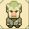
As a first step, we needed basic a character layout. The idea was to use someone who wasn't an efficient fighter (big surprise, I know), and who wasn't very athletic. Perhaps even worse, someone with bad health. Also, the character had to fit the time period we chose - sometime around the Edwardian period.

After picking who we thought looked best (and slightly like Stanley Kubrick too), a basic proportion sprite was created to ensure the character didn't look wildly different when facing different directions:
Detail work was obviously completely unimportant here - just the seams between the different body sections and a few placeholders (nose contours, hairline) were needed at this stage.
(By the way: Other than the general scale, it's also important to decide the angle you want to use for displaying the game world. When it's not absolutely necessary to do clean squares, I prefer to work at a 3/2 ratio, which is relatively easy to divide and tile:

While the tileset remains square-based, anything depicted in perspective would be scaled as pictured.)
With the rough model sprite done, the first simple walk cycle was created - keyframes only, meaning precisely four frames:

...which where then "dressed up", so to speak, according to the initial sketch. This was actually done on a pixel level, and very roughly to boot. Here you go:

So while the cycle is technically pixel art, it's hideously rough and dirty, for two reasons: One, because it's done at 200 % size initially anyway and will be scaled down, and two, because a bit of roughness can actually make most things look better. In the end. The hard part is soldiering on even though everything looks hideous right at that time.
Animation.wise, just two inbetween frames were added, for a total of six frames (lazy!).
The interim version looked like this:

This, obviously, looked hideously janky, especially when placed in the game - even at this small resolution, there's a sharp contrast between the (faux) detail on the character and the cheaping out on the inbetweens.
So in a few evenings' work, I doubled the frame count from 6 to 12, adding one tween per existing frame - leading up to the final cycles you see above.
It can really pay off to leave something for a few days and return with fresh eyes, I guess.
This project is in full steam right now - hopefully there'll be something neat to announce soon. Stay tuned!


Dude, those sprites are SICK! It's hard to believe those aren't 3D models/cg. Stay encouraged, and keep up the great work!
ReplyDeleteThis comment has been removed by the author.
ReplyDeleteThis is really really great. The quality is amazing. Thanks for hiking that standard bar high up there and teaching others how to try and reach it !:D
ReplyDelete(why is there no edit comment option on blogspot??)
Thanks!
DeleteThese are just tiny little bits of tutorial, and just what I can offer.
I'll do more animation mini-tutorials in the future, promise!
Followed the bread crumbs from TIG, the pixels/animation are amazing; Can't wait to know more about the game and, hopefully, see more tutorials.
DeleteKeep up the good work!
Can I ask if I need to know how to draw pixel art in order to animate? I only know how to animate, I'm a very bad pixel artist and I have no idea how to proceed.
ReplyDeleteAmazing stuff! Thank you for sharing the process!
ReplyDelete